
Introduction
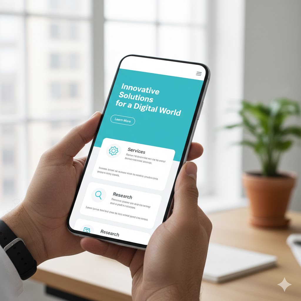
Responsive web design has become an essential requirement in a modern hyper connected world where users access the internet through smartphones, tablets, laptops, desktops, smart televisions, and wearable devices. Responsive web design ensures that digital content adapts effectively to different screen sizes, resolutions, and device types, allowing consistent interaction for all users. Rather than a universal layout, responsive web design provides flexibility and usability across diverse platforms. By implementing responsive web design, organisations can enhance user experience, improve search engine optimisation performance, and support inclusive digital accessibility. As technology continues to diversify, responsive web design remains a fundamental approach for delivering efficient and equitable online experiences.
What is Responsive Web Design
Responsive web design (RWD) is a web development technique, which allows websites to respond and change their layout and content according to the size, orientation and resolution of the user device. Rather than designing individual websites that work on various devices (e.g. a desktop and a mobile version), a universal responsive site is dynamically adjusted. The idea is to deliver the best viewing experience easy to read and navigate with the least amount of resizing, panning and scrolling of the pages across a huge variety of devices.
Learn more:
https://en.wikipedia.org/wiki/Responsive_web_design
Core Principles of Responsive Web Design
RWD is built upon three fundamental pillars:
- Flexible Grid Layouts: A responsive design implements proportion-based grids (percentages, ems, rems, vw/vh units) instead of the fixed-width pixel layouts. This enables elements to resize and rearrange freely to occupy the space that is available, be it a big monitor or a small smartphone screen.
- Flexible Images and Media: Images and videos among other media are resized proportionately within the surrounding items. This will avoid the issue of oversized media breaking the layout or the use of horizontal scrolling. Such techniques as max-width: 100% of images are essential in this case.
- Media Queries: These are CSS (Cascading Style Sheets) properties that enable designers to use various styles depending on the features of the device, including the screen width, height or orientation. The brains of the responsive design are media queries, which inform the layout to change at particular breakpoints.

Why Responsive Design is Crucial for Multi-Device Accessibility
Multi-device accessibility means ensuring that all users, regardless of their device, can perceive, understand, navigate, and interact with the web. Responsive design directly supports this in several ways:
- Consistent User Experience: Users expect a consistent brand experience across all touchpoints. RWD delivers this by maintaining your brand’s look and feel, even as the layout adapts.
- No More Pinch-to-Zoom: In non-responsive sites, users of mobile phones are usually forced to pinch and zoom to view the text or press tiny buttons. RWD removes this frustration through the provision of text, tap elements, and navigation in the right size.
- Improved Readability: Text sizes and line lengths are optimized for the viewing screen, reducing eye strain and improving comprehension.
- Easier Navigation: Menus often collapse into “hamburger” icons on smaller screens, making navigation clear and space-efficient without losing functionality.
- Enhanced Performance on Mobile: Although non-inherited, responsive design methods tend to create leaner, more mobile-friendly code and lighter assets, which are also speedier to load- another accessibility consideration particularly in networks slower or older devices.
Read more:
https://zzz.crea8ive.solutions/wp-admin/post.php?post=27574&action=edit
Responsive Design and SEO: A Symbiotic Relationship
Google officially endorses responsive web design as the preferred approach for mobile-friendly websites. Here’s why:
- Single URL: A responsive site uses one URL for all devices, simplifying Google’s indexing process. This avoids issues with duplicate content and consolidates link equity.
- Improved User Experience Signals: Google prioritizes websites that offer a good user experience. A responsive site naturally provides better mobile usability, which positively impacts signals like bounce rate and time on site.
- Mobile-First Indexing: Google primarily uses the mobile version of your content for indexing and ranking. A responsive site ensures that your mobile content is robust and fully crawlable.
Implementing Responsive Design: Key Considerations
Building a truly responsive and accessible website involves strategic planning:
Table: Key Considerations for Responsive Web Design
| Consideration | Description | Impact on Accessibility & UX |
| Mobile-First Approach | Developing to fit the smallest size screen first, and then gradually expanding to larger screens. | Prioritization of content in forces; core functionality on all devices; and enhanced performance. |
| Viewport Meta Tag | Critical HTML tag (<meta name= viewport…)) to regulate the way the browser magnifies the page on gadgets. | Precisely avoids the defaulting of browsers to desktop scaling; a requirement in the execution of responsive behaviors. |
| Touch Target Sizes | Making sure that buttons and links are sufficiently big (e.g. 44×44 CSS pixels) to touch on touchscreens. | Stops mis-taps; essential to people with motor disabilities; makes mobiles easier to use. |
| Content Prioritization | Choosing what is the most significant and ought to be at the top of the list of content that one sees at the first sight at smaller screens. | Declutters; enhances information structure; speeds up access to important data by the user. |
| Performance Optimization | Minimizing code size, image optimizing, exploiting browser caching. | The issue of faster load time is essential to mobile users and people with limited bandwidth/older devices. |
| Testing Across Devices | Periodically testing the website using different real devices and emulators and their looks. | Detects layout discontinuities, functionality problems, and accessibility prior to the launch. |
The Inclusive Design Mindset
Although responsive design is essential, the actual multi-device accessibility considers the inclusive design on a larger scale. This involves taking into consideration individuals with disabilities, making sure that keyboard navigation is supported, making sure that there is adequate color contrast, and alternative text to images. A flexible framework offers the flexibility needed, but the content and the interactive component should also be tailored to the needs of various users.
Conclusion
Responsive web design has ceased to be a trend, but rather an industry standard that aims at the fundamental requirement of multi-device accessibility. Through flexible layouts, media and media queries, web developers can develop websites that will gracefully respond to any screen, will provide improved user experience, will mitigate effective search engine performance, and will result in real digital inclusion. In the age of pixels being counted and users being counted, responsive design is an investment in your digital future of making sure that the message the company is putting across reaches all people, all places, and all platforms.
Frequently Asked Questions (FAQs)
Responsive design uses a single fluid layout that “flows” to fit any screen size perfectly. Adaptive design creates several fixed layouts for specific screen sizes (like iPhone or iPad) and snaps to the closest one.
Media queries are CSS filters that detect the device’s screen width or orientation. They tell the website to change styles—like hiding a sidebar or enlarging text—once the screen reaches a specific “breakpoint.
Starting with the smallest screen forces you to prioritize essential content and features first. It is easier to add complexity for desktop screens than it is to strip away a cluttered desktop design for mobile.
It can if not optimized, as mobile devices might download large desktop-sized images. However, using “responsive images” (serving different file sizes based on the device) ensures fast performance and saves user data.
You can use browser developer tools to simulate different devices or simply resize your browser window to see if content shifts smoothly. Testing on actual physical devices is the most reliable way to check touch targets and scrolling.
This is very useful.